Flutter TabBar:自定义标签栏的样式
TabBar Widget 下可以通过下面的属性来自定义样式:
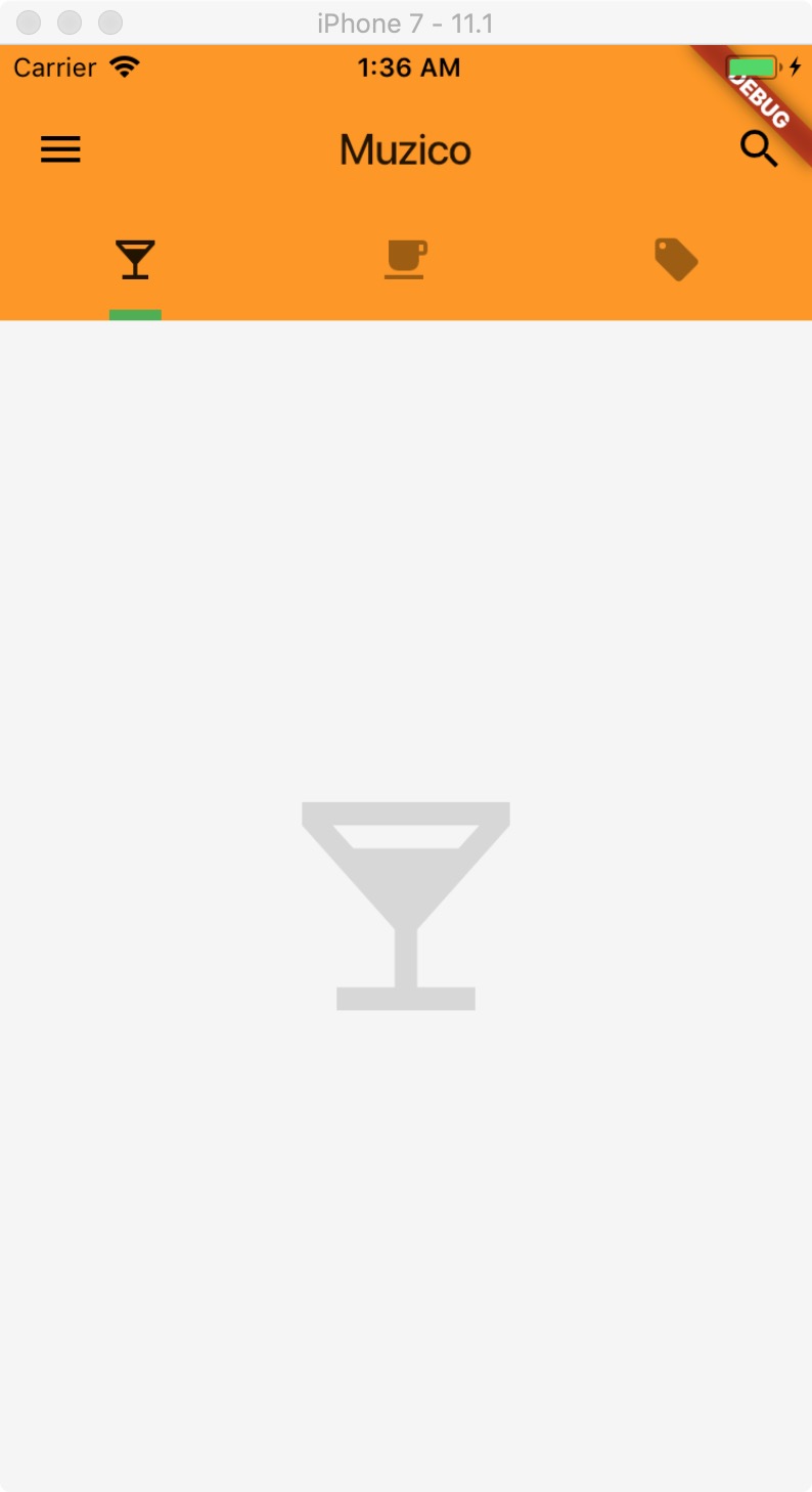
unselectedLabelColor,没有选中的标签的颜色。
indicatorColor,当前选中标签的指示条的颜色。
indicatorSize,当前选中标签的指示条的大小(宽度),默认为TabBarIndicatorSize.tab值,可以设置为TabBarIndicatorSize.label 就可以和标签一样大小了。
indicatorWeight,当前选中标签的指示条的高度,默认为 2.0。
class Home extends StatelessWidget {
  @override
    Widget build(BuildContext context) {
      return DefaultTabController(
        length: 3,
        child: Scaffold(
          backgroundColor: Colors.grey[100],
          appBar: AppBar(
            title: Text('Muzico'),
            elevation: 0.0,
            leading: IconButton(
              icon: Icon(Icons.menu),
              tooltip: 'Navigation',
              onPressed: () => debugPrint('Navigation button is pressed.'),
            ),
            actions: <Widget>[
              IconButton(
                icon: Icon(Icons.search),
                tooltip: 'Search',
                onPressed: () => debugPrint('Search button is pressed.'),
              ),
            ],
            bottom: TabBar(
              unselectedLabelColor: Colors.black38,
              indicatorColor: Colors.green,
              indicatorSize: TabBarIndicatorSize.label,
              indicatorWeight: 5.0,
              tabs: <Widget>[
                Tab(icon: Icon(Icons.local_bar),),
                Tab(icon: Icon(Icons.local_cafe),),
                Tab(icon: Icon(Icons.local_offer),),
              ],
            ),
            ),
            body: TabBarView(
              children: <Widget>[
                Icon(Icons.local_bar, size: 128.0, color: Colors.black12,),
                Icon(Icons.local_cafe, size: 128.0, color: Colors.black12,),
                Icon(Icons.local_offer, size: 128.0, color: Colors.black12,),
              ],
            ),
        ),
      );
    }
}