flexBox 学习
最初的代码:
<!DOCTYPE html>
<head>
<style>
</style>
</head>
<body>
    <div class='container'>
        <div class='item'>item 1</div>
        <div class='item'>item 2</div>
        <div class='item'>item 3</div>
    </div>
</body>
</html>
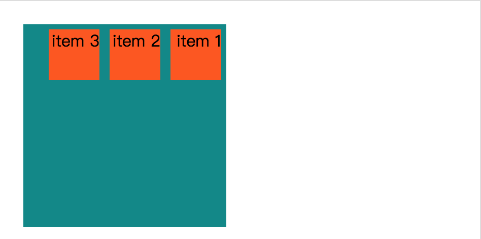
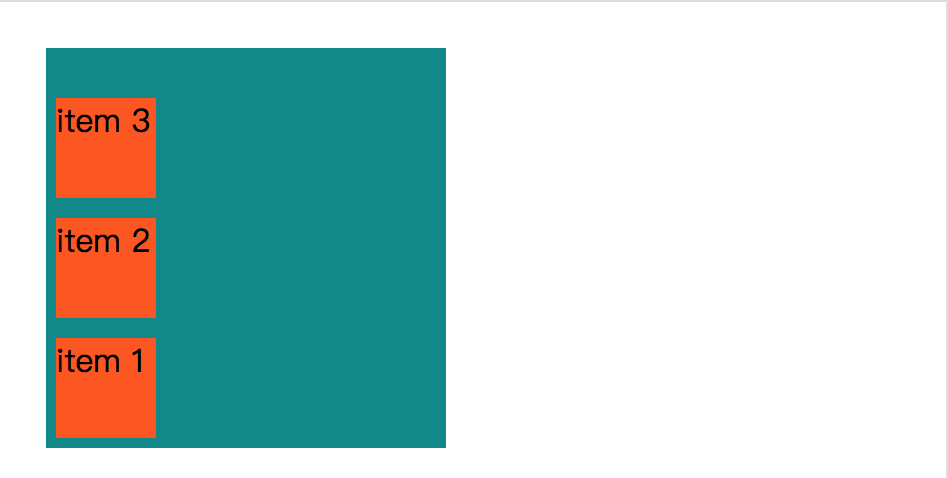
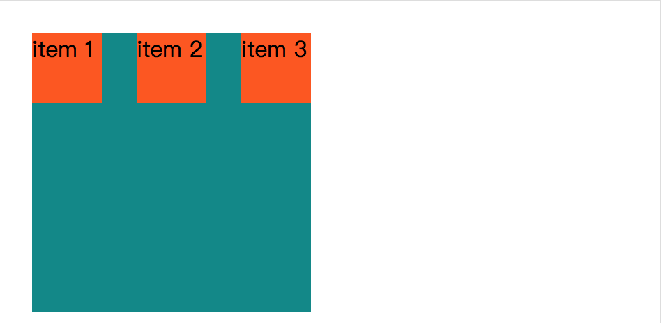
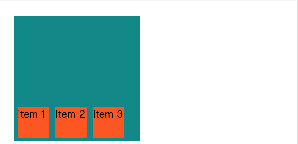
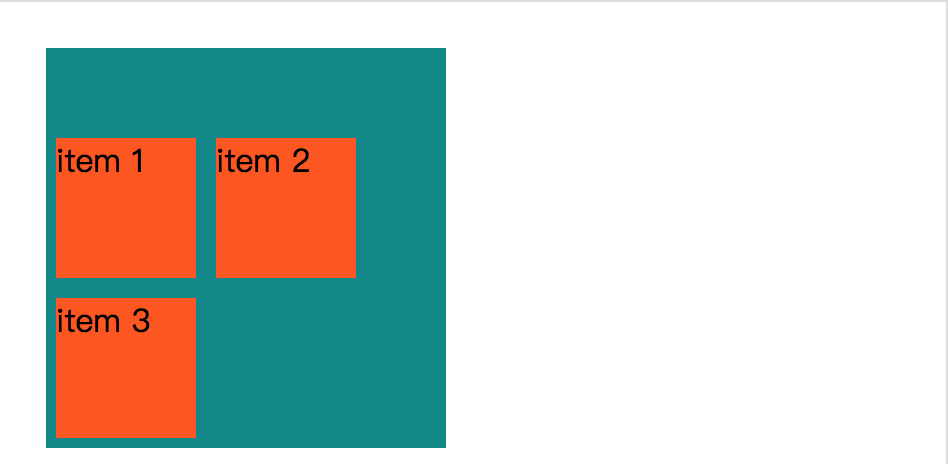
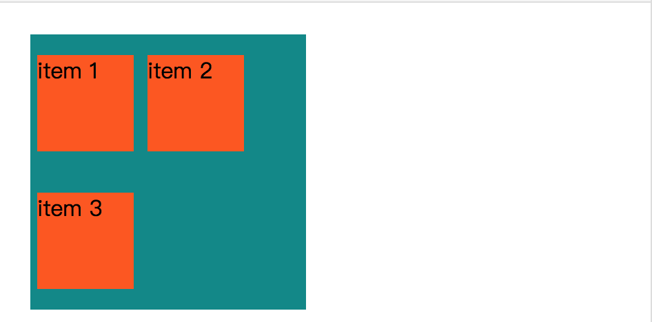
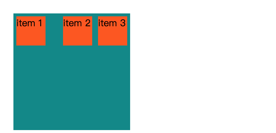
效果:
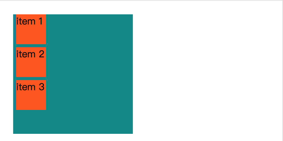
这样学习的话好像不容易看出效果。给它加上颜色改变一下大小,让它变得更好理解。
<!DOCTYPE html>
<head>
<style>
    .item {
        background-color: #ff5606;
        width: 50px;
        height: 50px;
        margin: 5px;
    }
    .container {
        width: 200px;
        height: 200px;
        background-color: #008989;
    }
</style>
</head>
<body>
    <div class='container'>
        <div class='item'>item 1</div>
        <div class='item'>item 2</div>
        <div class='item'>item 3</div>
    </div>
</body>
</html>
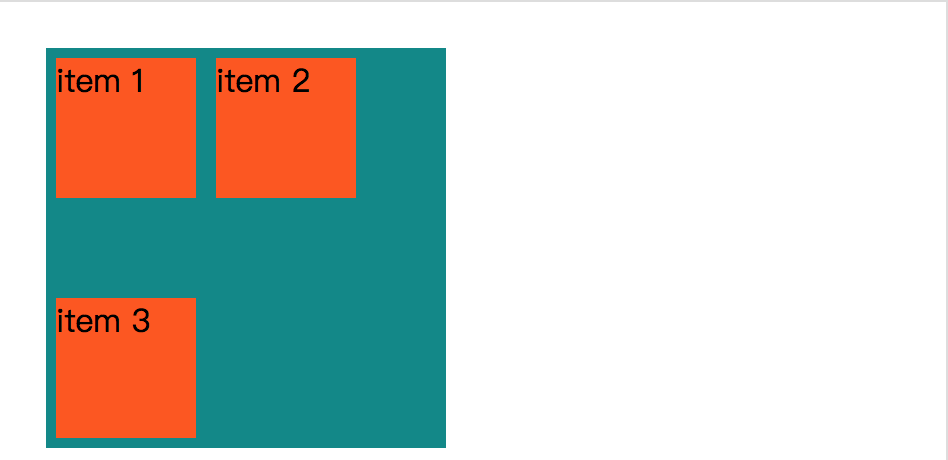
效果:
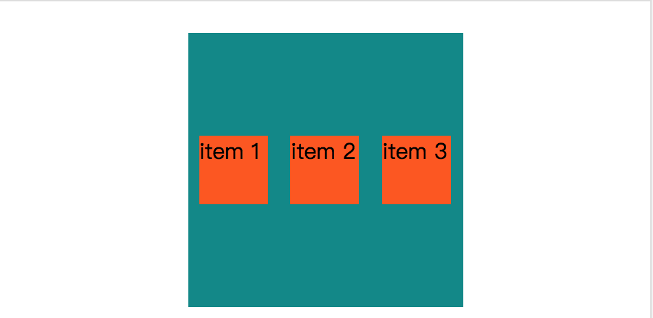
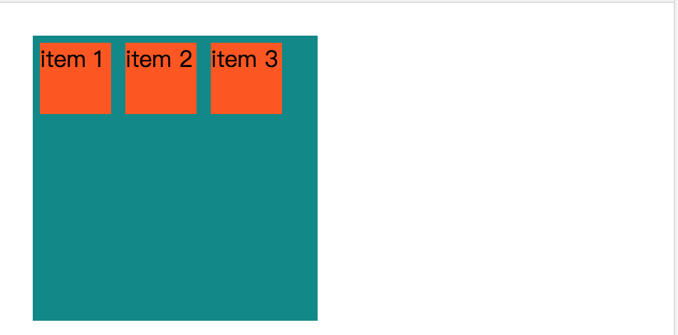
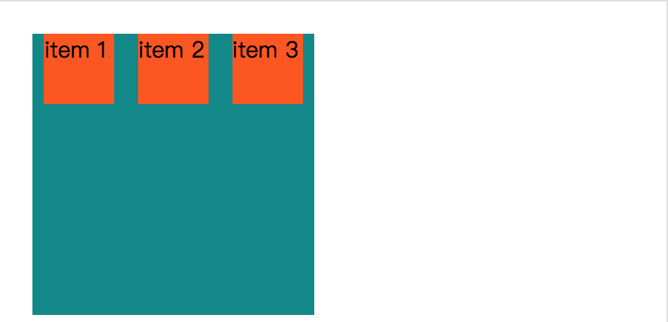
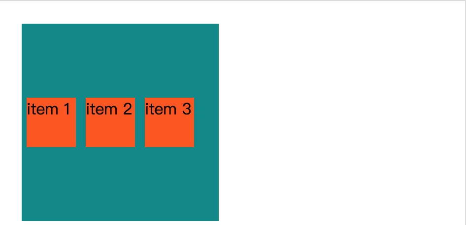
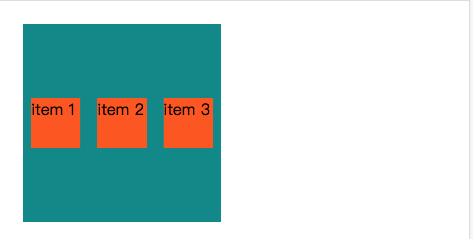
接下来,我们要把这个定义为是flexbox,上面还不是flexbox。
<!DOCTYPE html>
<head>
<style>
    .item {
        background-color: #ff5606;
        width: 50px;
        height: 50px;
        margin: 5px;
    }
    .container {
        width: 200px;
        height: 200px;
        background-color: #008989;
        display: flex;
        display: -webkit-flex;
    }
</style>
</head>
<body>
    <div class='container'>
        <div class='item'>item 1</div>
        <div class='item'>item 2</div>
        <div class='item'>item 3</div>
    </div>
</body>
</html>
效果:
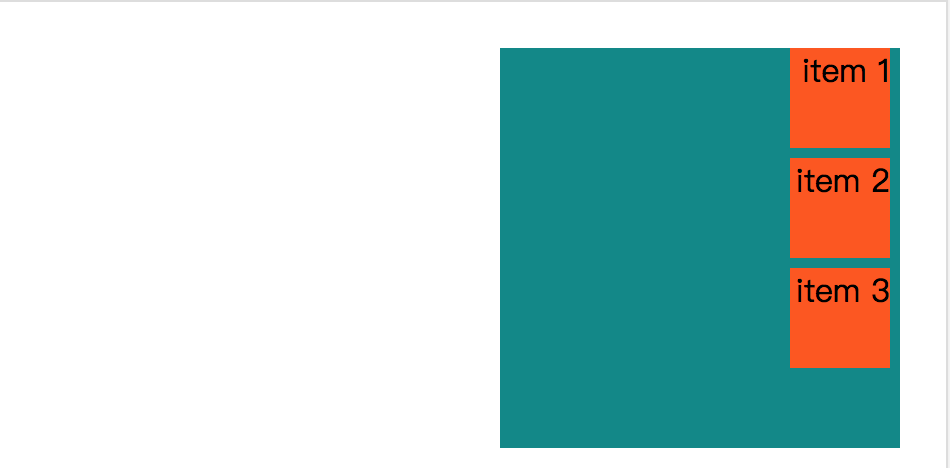
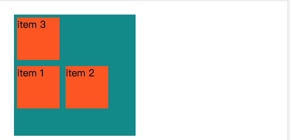
可以看到,设置 display 属性为 flex,就可以将它转变成一个 flexbox。
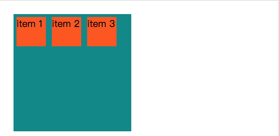
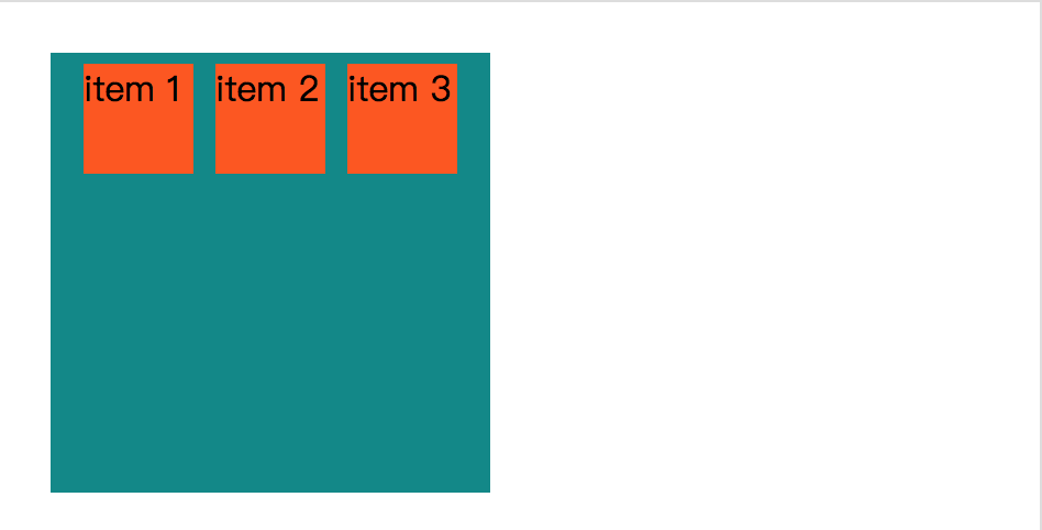
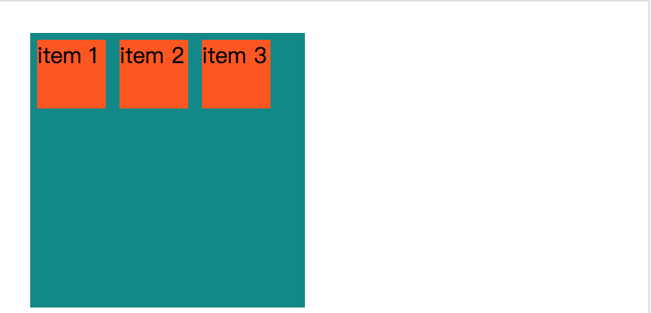
通过设置 direction 属性为 rtl (right to left),可以改变子元素的排列方式。
<!DOCTYPE html>
<head>
<style>
    .item {
        background-color: #ff5606;
        width: 50px;
        height: 50px;
        margin: 5px;
    }
    .container {
        width: 200px;
        height: 200px;
        background-color: #008989;
        display: flex;
        display: -webkit-flex;
        direction: rtl;
    }
</style>
</head>
<body>
    <div class='container'>
        <div class='item'>item 1</div>
        <div class='item'>item 2</div>
        <div class='item'>item 3</div>
    </div>
</body>
</html>
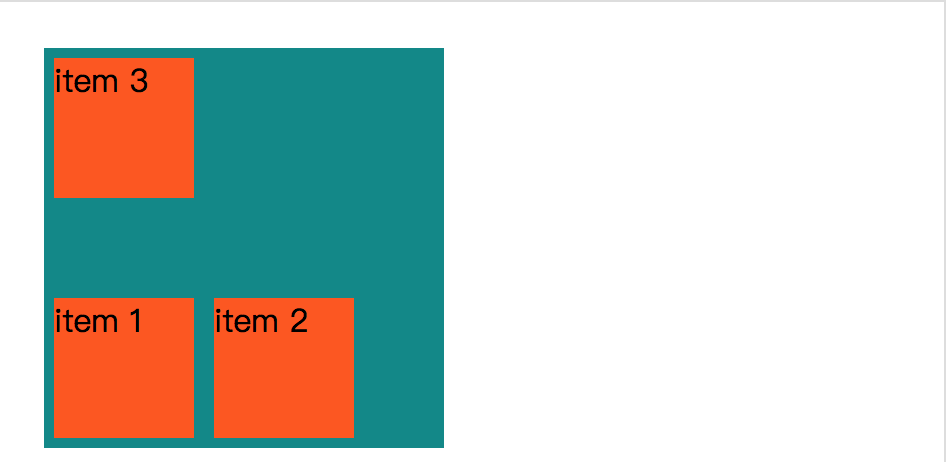
效果:
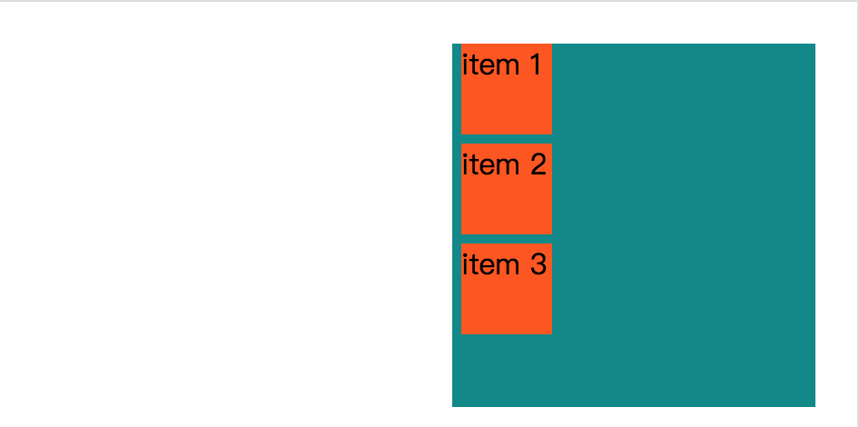
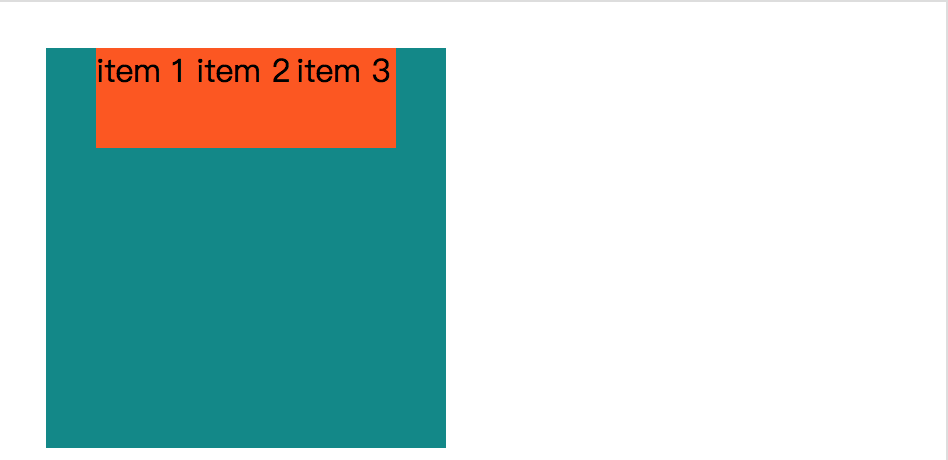
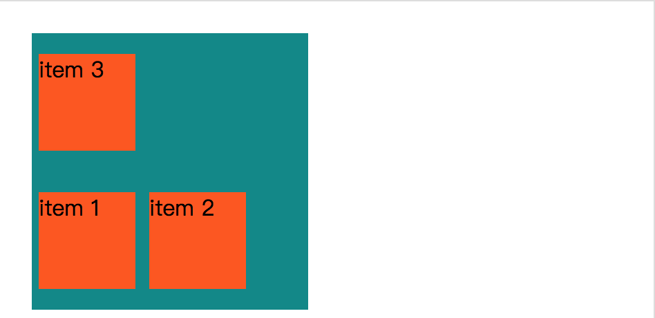
测试的时候,发现如果 body 设置 direction 属性,改变其子元素的排列方式。而且还发现无需设置 display 属性,这个神奇啊~~~
<!DOCTYPE html>
<head>
<style>
    .item {
        background-color: #ff5606;
        width: 50px;
        height: 50px;
        margin: 5px;
    }
    .container {
        width: 200px;
        height: 200px;
        background-color: #008989;
    }
    body {
        direction: rtl;
    }
</style>
</head>
<body>
    <div class='container'>
        <div class='item'>item 1</div>
        <div class='item'>item 2</div>
        <div class='item'>item 3</div>
    </div>
</body>
</html>
效果:
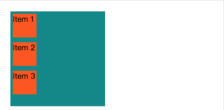
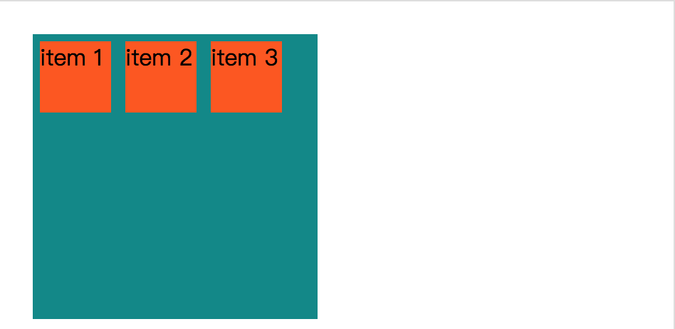
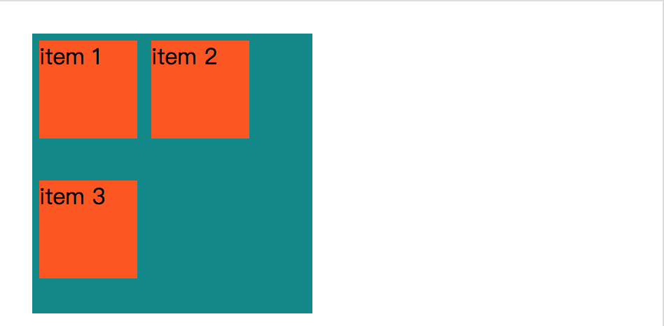
发现 direction 属性真的可以无视 display属性是否设置了值,就可以生效。
<!DOCTYPE html>
<head>
<style>
    .item {
        background-color: #ff5606;
        width: 50px;
        height: 50px;
        margin: 5px;
    }
    .container {
        width: 200px;
        height: 200px;
        background-color: #008989;
        direction: ltr;
    }
    body {
        direction: rtl;
    }
</style>
</head>
<body>
    <div class='container'>
        <div class='item'>item 1</div>
        <div class='item'>item 2</div>
        <div class='item'>item 3</div>
    </div>
</body>
</html>
效果:
flex 有个专属的 direction 属性叫:flex-direction。
flex-direction
flex-direction : row | row-reverse | column | column-reverse

row:横向从左到右排列(左对齐),默认的排列方式。
row-reverse:反转横向排列(右对齐,从后往前排,最后一项排在最前面。
column:纵向排列。
column-reverse:反转纵向排列,从后往前排,最后一项排在最上面。
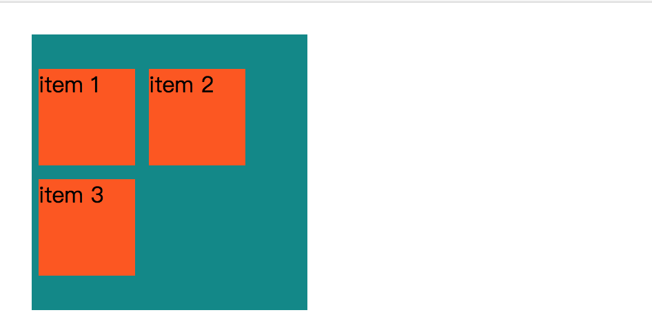
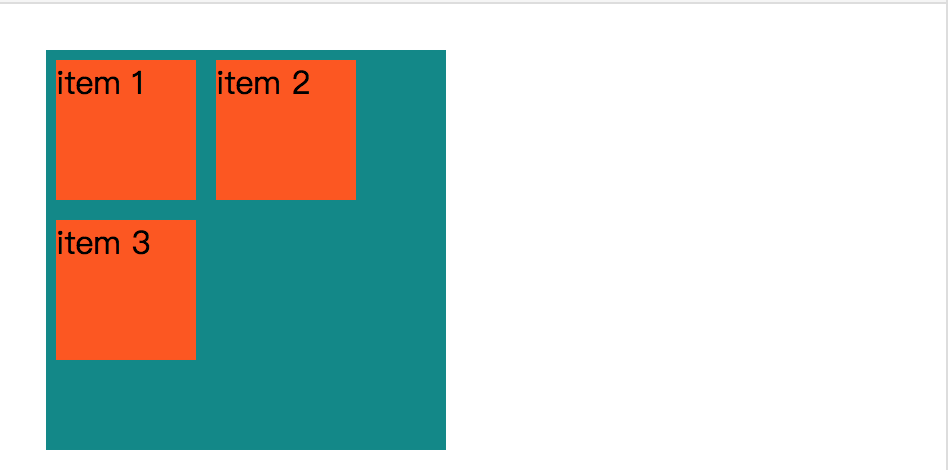
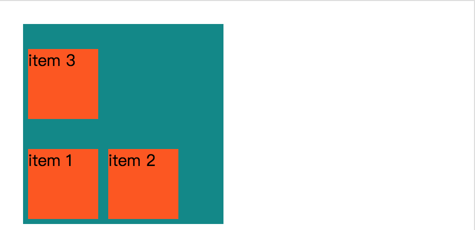
如果没有设置 display 属性的话,那么flex-direction 真的不会生效。
<!DOCTYPE html>
<head>
<style>
    .item {
        background-color: #ff5606;
        width: 50px;
        height: 50px;
        margin: 5px;
    }
    .container {
        width: 200px;
        height: 200px;
        background-color: #008989;
        flex-direction: row-reverse;
        display: flex;
        display: -webkit-flex;
    }
</style>
</head>
<body>
    <div class='container'>
        <div class='item'>item 1</div>
        <div class='item'>item 2</div>
        <div class='item'>item 3</div>
    </div>
</body>
</html>
效果:

flex-direction: column;
效果:
flex-direction: column-reverse;
效果:
justify-content
内容对齐(justify-content)属性应用在弹性容器上,把弹性项沿着弹性容器的主轴线(main axis)对齐。
justify-content : flex-start | flex-end | center | space-between | space-around

flex-start:
弹性项目向行头紧挨着填充。这个是默认值。第一个弹性项的main-start外边距边线被放置在该行的main-start边线,而后续弹性项依次平齐摆放。

flex-end:
弹性项目向行尾紧挨着填充。第一个弹性项的main-end外边距边线被放置在该行的main-end边线,而后续弹性项依次平齐摆放。

center:
弹性项目居中紧挨着填充。(如果剩余的自由空间是负的,则弹性项目将在两个方向上同时溢出)。

space-between:
弹性项目平均分布在该行上。如果剩余空间为负或者只有一个弹性项,则该值等同于flex-start。否则,第1个弹性项的外边距和行的main-start边线对齐,而最后1个弹性项的外边距和行的main-end边线对齐,然后剩余的弹性项分布在该行上,相邻项目的间隔相等。

space-around:
弹性项目平均分布在该行上,两边留有一半的间隔空间。如果剩余空间为负或者只有一个弹性项,则该值等同于center。否则,弹性项目沿该行分布,且彼此间隔相等(比如是20px),同时首尾两边和弹性容器之间留有一半的间隔(1/2*20px=10px)。
<!DOCTYPE html>
<head>
<style>
    .item {
        background-color: #ff5606;
        width: 50px;
        height: 50px;
        margin: 5px;
    }
    .container {
        width: 200px;
        height: 200px;
        background-color: #008989;
        display: flex;
        display: -webkit-flex;
        justify-content: flex-start;
        -webkit-justify-content: flex-start;
    }
</style>
</head>
<body>
    <div class='container'>
        <div class='item'>item 1</div>
        <div class='item'>item 2</div>
        <div class='item'>item 3</div>
    </div>
</body>
</html>
效果:
justify-content: flex-end;
-webkit-justify-content: flex-end;
效果:

justify-content: center;
-webkit-justify-content: center;
效果:
.item {
        background-color: #ff5606;
        width: 50px;
        height: 50px;
        margin: 0px;
    }
    .container {
        width: 200px;
        height: 200px;
        background-color: #008989;
        display: flex;
        display: -webkit-flex;
        justify-content: center;
        -webkit-justify-content: center;
    }
效果:
.item {
        background-color: #ff5606;
        width: 50px;
        height: 50px;
        margin: 0px;
    }
.container {
        width: 200px;
        height: 200px;
        background-color: #008989;
        display: flex;
        display: -webkit-flex;
        justify-content: space-between;
        -webkit-justify-content: space-between;
    }
效果:
.item {
        background-color: #ff5606;
        width: 50px;
        height: 50px;
        margin: 0px;
    }
.container {
        width: 200px;
        height: 200px;
        background-color: #008989;
        display: flex;
        display: -webkit-flex;
        justify-content: space-around;
        -webkit-justify-content: space-around;
    }
效果:
align-items
align-items 设置或检索弹性盒子元素在侧轴(纵轴)方向上的对齐方式。
align-items : flex-start | flex-end | center | baseline | stretch

flex-start:弹性盒子元素的侧轴(纵轴)起始位置的边界紧靠住该行的侧轴起始边界。
flex-end:弹性盒子元素的侧轴(纵轴)起始位置的边界紧靠住该行的侧轴结束边界。
center:弹性盒子元素在该行的侧轴(纵轴)上居中放置。(如果该行的尺寸小于弹性盒子元素的尺寸,则会向两个方向溢出相同的长度)。
baseline:如弹性盒子元素的行内轴与侧轴为同一条,则该值与'flex-start'等效。其它情况下,该值将参与基线对齐。
stretch:如果指定侧轴大小的属性值为'auto',则其值会使项目的边距盒的尺寸尽可能接近所在行的尺寸,但同时会遵照'min/max-width/height'属性的限制。
<!DOCTYPE html>
<head>
<style>
    .item {
        background-color: #ff5606;
        width: 50px;
        height: 50px;
        margin: 5px;
    }
    .container {
        width: 200px;
        height: 200px;
        background-color: #008989;
        display: flex;
        display: -webkit-flex;
        align-items: stretch;
        -webkit-align-items: stretch;
    }
</style>
</head>
<body>
    <div class='container'>
        <div class='item'>item 1</div>
        <div class='item'>item 2</div>
        <div class='item'>item 3</div>
    </div>
</body>
</html>
效果:
align-items: flex-end;
-webkit-align-items: flex-start;
效果:
align-items: flex-end;
-webkit-align-items: flex-end;
效果:
align-items: center;
-webkit-align-items: center;
效果:
align-items: baseline;
-webkit-align-items: baseline;
效果:

flex-wrap
flex-wrap 属性用于指定弹性盒子的子元素换行方式。
flex-wrap : nowrap | wrap | wrap-reverse | initial | inherit

nowrap - 默认, 弹性容器为单行。该情况下弹性子项可能会溢出容器。
wrap - 弹性容器为多行。该情况下弹性子项溢出的部分会被放置到新行,子项内部会发生断行
wrap-reverse -反转 wrap 排列。
<!DOCTYPE html>
<head>
<style>
    .item {
        background-color: #ff5606;
        width: 50px;
        height: 50px;
        margin: 5px;
    }
    .container {
        width: 200px;
        height: 200px;
        background-color: #008989;
        display: flex;
        display: -webkit-flex;
        -webkit-flex-wrap = nowrap;
        flex-wrap = nowrap;
    }
</style>
</head>
<body>
    <div class='container'>
        <div class='item'>item 1</div>
        <div class='item'>item 2</div>
        <div class='item'>item 3</div>
    </div>
</body>
</html>
效果:

align-content
align-content 属性用于修改 flex-wrap 属性的行为。类似于 align-items, 但它不是设置弹性子元素的对齐,而是设置各个行的对齐。
align-content : flex-start | flex-end | center | space-between | space-around | stretch

stretch - 默认。各行将会伸展以占用剩余的空间。
flex-start - 各行向弹性盒容器的起始位置堆叠。
flex-end - 各行向弹性盒容器的结束位置堆叠。
center -各行向弹性盒容器的中间位置堆叠。
space-between -各行在弹性盒容器中平均分布。
space-around - 各行在弹性盒容器中平均分布,两端保留子元素与子元素之间间距大小的一半。
.item {
        background-color: #ff5606;
        width: 70px;
        height: 70px;
        margin: 5px;
    }
    .container {
        width: 200px;
        height: 200px;
        background-color: #008989;
        display: flex;
        display: -webkit-flex;
        -webkit-flex-wrap: wrap;
        flex-wrap: wrap;
        align-content: center;
        -webkit-align-content: center;
    }
效果:
.item {
        background-color: #ff5606;
        width: 70px;
        height: 70px;
        margin: 5px;
    }
    .container {
        width: 200px;
        height: 200px;
        background-color: #008989;
        display: flex;
        display: -webkit-flex;
        -webkit-flex-wrap: wrap;
        flex-wrap: wrap;
        align-content: flex-start;
        -webkit-align-content: flex-start;
    }
效果:
.item {
        background-color: #ff5606;
        width: 70px;
        height: 70px;
        margin: 5px;
    }
    .container {
        width: 200px;
        height: 200px;
        background-color: #008989;
        display: flex;
        display: -webkit-flex;
        -webkit-flex-wrap: wrap;
        flex-wrap: wrap;
        align-content: flex-end;
        -webkit-align-content: flex-end;
    }
效果:
.item {
        background-color: #ff5606;
        width: 70px;
        height: 70px;
        margin: 5px;
    }
    .container {
        width: 200px;
        height: 200px;
        background-color: #008989;
        display: flex;
        display: -webkit-flex;
        -webkit-flex-wrap: wrap-reverse;
        flex-wrap: wrap-reverse;
        align-content: flex-end;
        -webkit-align-content: flex-end;
    }
效果:
.item {
        background-color: #ff5606;
        width: 70px;
        height: 70px;
        margin: 5px;
    }
    .container {
        width: 200px;
        height: 200px;
        background-color: #008989;
        display: flex;
        display: -webkit-flex;
        -webkit-flex-wrap: wrap;
        flex-wrap: wrap;
        align-content: space-between;
        -webkit-align-content: space-between;
    }
效果:
.item {
        background-color: #ff5606;
        width: 70px;
        height: 70px;
        margin: 5px;
    }
    .container {
        width: 200px;
        height: 200px;
        background-color: #008989;
        display: flex;
        display: -webkit-flex;
        -webkit-flex-wrap: wrap-reverse;
        flex-wrap: wrap-reverse;
        align-content: space-between;
        -webkit-align-content: space-between;
    }
效果:
.item {
        background-color: #ff5606;
        width: 70px;
        height: 70px;
        margin: 5px;
    }
    .container {
        width: 200px;
        height: 200px;
        background-color: #008989;
        display: flex;
        display: -webkit-flex;
        -webkit-flex-wrap: wrap;
        flex-wrap: wrap;
        align-content: space-around;
        -webkit-align-content: space-around;
    }
效果:
.item {
        background-color: #ff5606;
        width: 70px;
        height: 70px;
        margin: 5px;
    }
    .container {
        width: 200px;
        height: 200px;
        background-color: #008989;
        display: flex;
        display: -webkit-flex;
        -webkit-flex-wrap: wrap-reverse;
        flex-wrap: wrap-reverse;
        align-content: space-around;
        -webkit-align-content: space-around;
    }
效果:
.item {
        background-color: #ff5606;
        width: 70px;
        height: 70px;
        margin: 5px;
    }
    .container {
        width: 200px;
        height: 200px;
        background-color: #008989;
        display: flex;
        display: -webkit-flex;
        -webkit-flex-wrap: wrap;
        flex-wrap: wrap;
        align-content: stretch;
        -webkit-align-content: stretch;
    }
效果:
.item {
        background-color: #ff5606;
        width: 70px;
        height: 70px;
        margin: 5px;
    }
    .container {
        width: 200px;
        height: 200px;
        background-color: #008989;
        display: flex;
        display: -webkit-flex;
        -webkit-flex-wrap: wrap-reverse;
        flex-wrap: wrap-reverse;
        align-content: stretch;
        -webkit-align-content: stretch;
    }
效果:
弹性子元素属性
排序
order : <integer>

<integer>:用整数值来定义排列顺序,数值小的排在前面。可以为负值。
<!DOCTYPE html>
<head>
<style>
    .item {
        background-color: #ff5606;
        width: 50px;
        height: 50px;
        margin: 5px;
    }
    .container {
        width: 200px;
        height: 200px;
        background-color: #008989;
        display: flex;
        display: -webkit-flex;
    }
    .first {
        order: -1;
        -webkit-order: -1;
    }
    .last {
        order: 9;
        -webkit-order: 9;
    }
</style>
</head>
<body>
    <div class='container'>
        <div class='item last'>item 1</div>
        <div class='item first'>item 2</div>
        <div class='item'>item 3</div>
    </div>
</body>
</html>
效果:

对齐
设置"margin"值为"auto"值,自动获取弹性容器中剩余的空间。所以设置垂直方向margin值为"auto",可以使弹性子元素在弹性容器的两上轴方向都完全集中。
以下实例在第一个弹性子元素上设置了 margin-right: auto; 。 它将剩余的空间放置在元素的右侧:
<!DOCTYPE html>
<html>
<head>
<meta charset="utf-8">
<title>菜鸟教程(runoob.com)</title>
<style>
.flex-container {
    display: -webkit-flex;
    display: flex;
    width: 400px;
    height: 250px;
    background-color: lightgrey;
}

.flex-item {
    background-color: cornflowerblue;
    width: 75px;
    height: 75px;
    margin: 10px;
}

.flex-item:first-child {
    margin-right: auto;
}
</style>
</head>
<body>

<div class="flex-container">
  <div class="flex-item">flex item 1</div>
  <div class="flex-item">flex item 2</div>
  <div class="flex-item">flex item 3</div>
</div>

</body>
</html>
效果:
完美的居中
以下实例将完美解决我们平时碰到的居中问题。
使用弹性盒子,居中变的很简单,只想要设置 margin: auto; 可以使得弹性子元素在两上轴方向上完全居中:
<!DOCTYPE html>
<head>
<style>
    .item {
        background-color: #ff5606;
        width: 50px;
        height: 50px;
        margin: auto;
    }
    .container {
        width: 200px;
        height: 200px;
        background-color: #008989;
        display: flex;
        display: -webkit-flex;
    }
</style>
</head>
<body>
    <div class='container'>
        <div class='item'>item 1</div>
        <div class='item'>item 2</div>
        <div class='item'>item 3</div>
    </div>
</body>
</html>
效果:
.item {
        background-color: #ff5606;
        width: 50px;
        height: 50px;
        margin: auto;
    }
    .container {
        width: 200px;
        height: 200px;
        background-color: #008989;
        display: flex;
        display: -webkit-flex;
        margin: auto;
    }
效果: